Table of Contents
A well-crafted landing page can be the difference between a campaign that converts and one that collapses. In performance marketing, your landing page is not just a visual experience — it’s the psychological handshake between your brand and the user.
Yet, despite endless testing and optimization frameworks, many campaigns silently bleed conversions due to fundamental — and avoidable — landing page mistakes.
If your click-through rates are strong but your conversions remain weak, your landing page might be the culprit. Let’s dive deep into the most common landing page mistakes killing your lead generation campaigns, understand how to fix them, and explore before-and-after scenarios that show how subtle design and content shifts can transform performance.
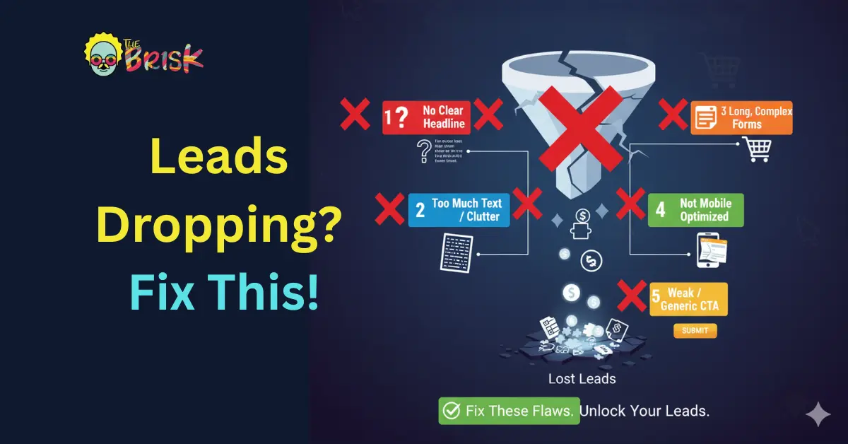
Common Errors
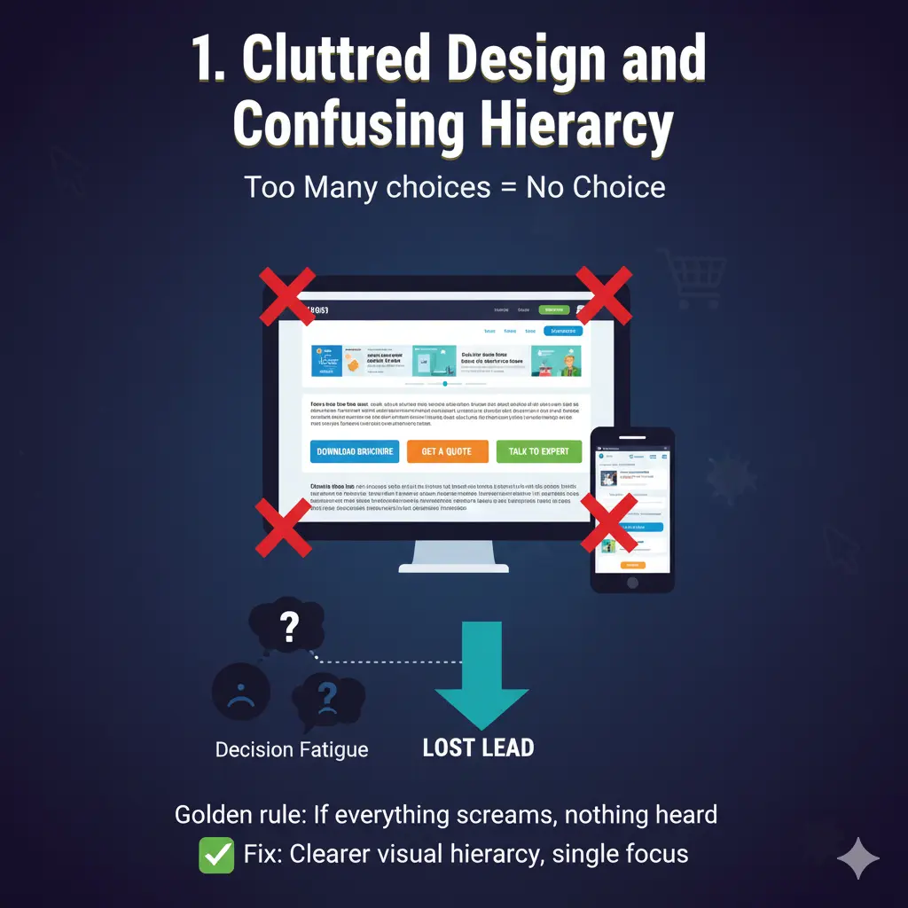
1. Cluttered Design and Confusing Hierarchy
The golden rule of conversion design: If everything screams for attention, nothing gets it.
Marketers often overload landing pages with multiple CTAs, large chunks of text, conflicting colors, or irrelevant visuals — assuming more information means more persuasion. Instead, it overwhelms the user and breaks cognitive flow.
A cluttered layout dilutes the message hierarchy, leading to decision fatigue. The visitor doesn’t know what to do next. The consequence? They leave — fast.
Example:
- Too many CTAs like “Download Brochure,” “Get a Quote,” and “Talk to Expert” competing for clicks.
- Banner sliders with multiple offers — none fully grasped.
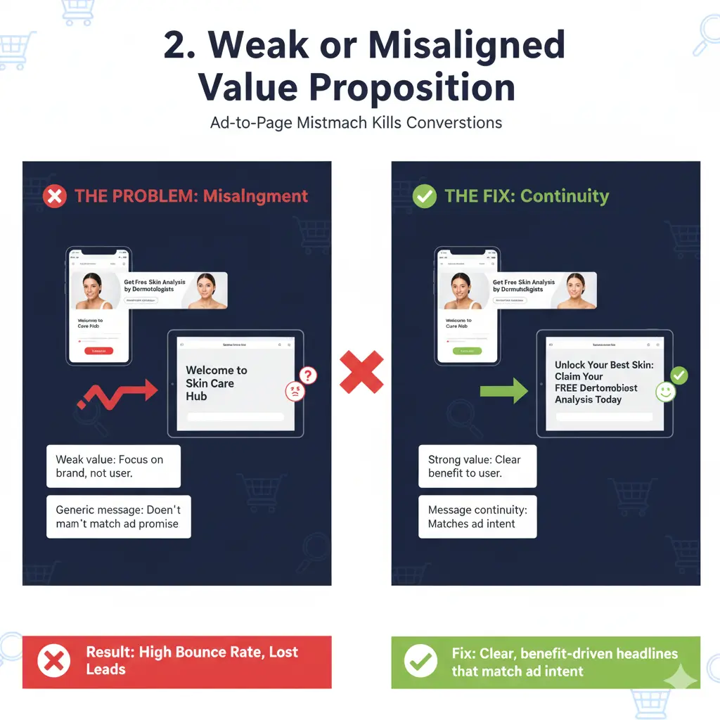
2. Weak or Misaligned Value Proposition
Your headline is your first impression. If it doesn’t clearly communicate what’s in it for me, users bounce within seconds.
A weak value proposition either focuses too much on the brand (“We are the best…”) or stays vague (“Grow your business today”) — without addressing the user’s pain point or the specific solution you offer.
In lead gen campaigns, this disconnect is fatal. Even if your ad targeting is perfect, a weak landing page message causes a jarring experience between the ad promise and the landing delivery.
Example:
- Ad: “Get Free Skin Analysis by Dermatologists.”
- Landing Page Headline: “Welcome to Skin Care Hub” → The user instantly loses intent continuity.
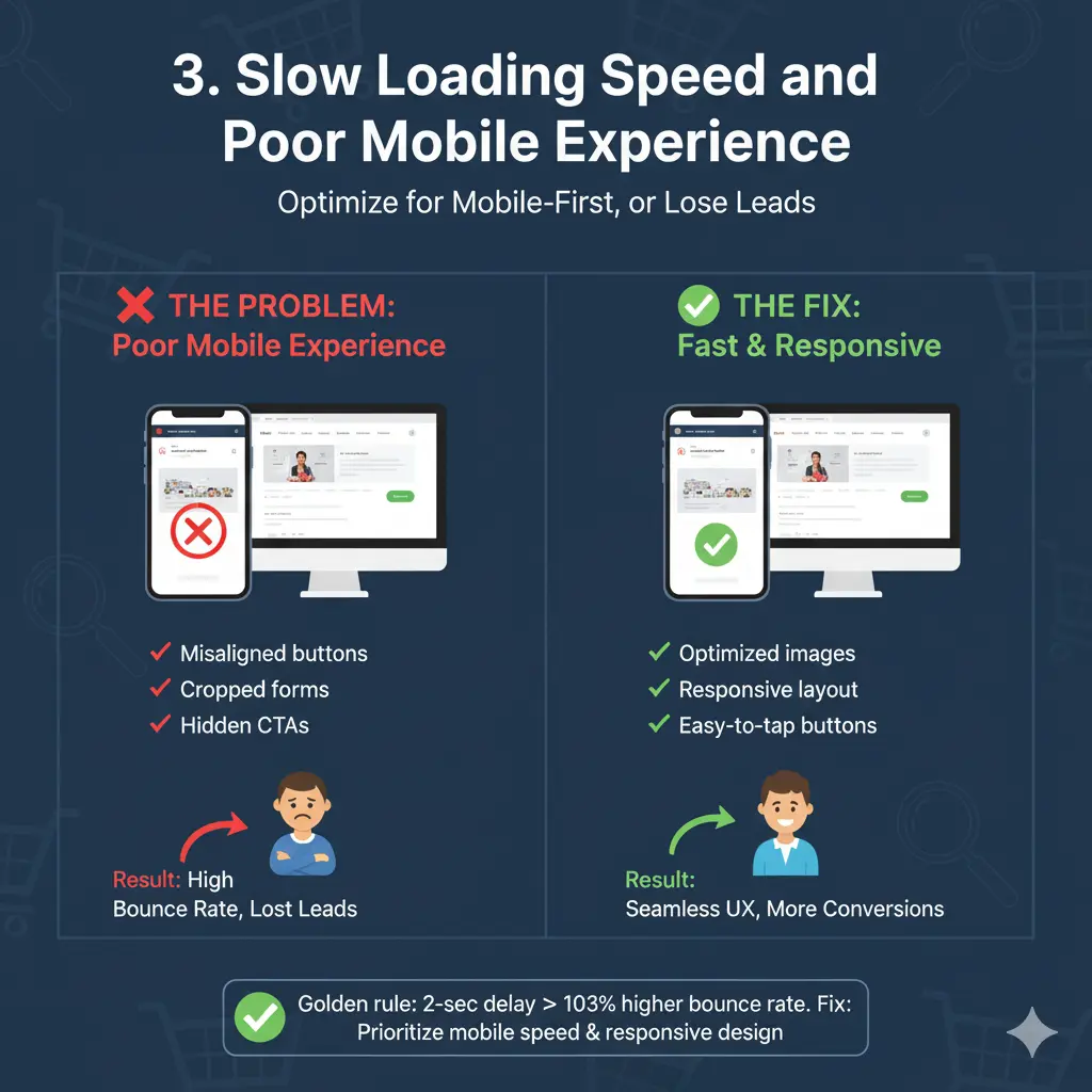
3. Slow Loading Speed and Poor Mobile Experience
Over 60% of landing page visits now come from mobile. Yet, many still load sluggishly or render poorly on smaller screens. A 2-second delay can lead to a 103% increase in bounce rate.
Bulky hero images, uncompressed scripts, or unnecessary animations can ruin user patience. Moreover, non-responsive layouts that shift buttons or hide CTAs under folds cripple conversion opportunities.
Example:
- Desktop version looks stunning but mobile shows misaligned buttons, cropped forms, or overlapping text.
- Users can’t fill out forms easily due to small touch targets.
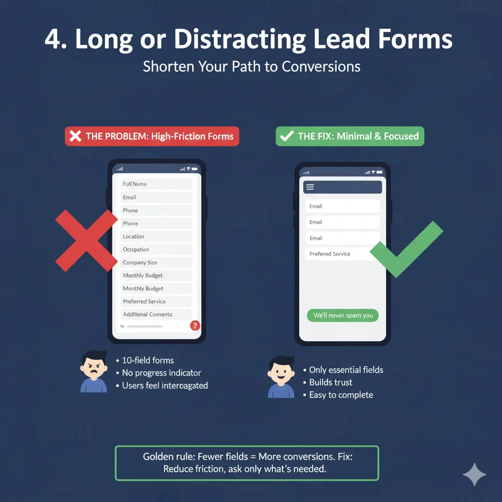
4. Long or Distracting Lead Forms
If your form feels like a tax filing process, expect drop-offs.
Many marketers try to collect too much information upfront — phone, email, location, occupation, budget, preferences — before even establishing trust. The result? Users feel interrogated instead of invited.
The rule of thumb is to reduce friction. Capture only what you need for the next step in the funnel. Once trust is built (through an email or call follow-up), you can always enrich the data later.
Example:
- 10-field forms for a simple “Get Consultation” offer.
- No progress indicator or reassurance message (“We’ll never spam you”).
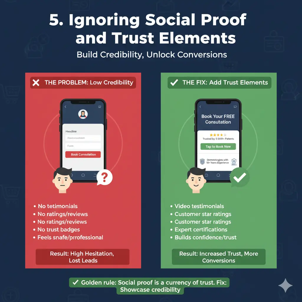
5. Ignoring Social Proof and Trust Elements
Lead gen thrives on credibility. If your landing page lacks reviews, testimonials, ratings, or recognizable brand trust cues, users hesitate to share their information.
Think of it like walking into a clinic with no nameboard, no certifications, and no patient reviews — even if it’s excellent, it doesn’t feel safe.
Social proof (logos, testimonials, case studies, media mentions) signals that others have trusted you before. Trust badges (SSL, certifications, doctor profiles, client count) seal the final hesitation gap.
Example:
- A health clinic form says “Book Consultation,” but lacks any mention of “Dermatologists with 10+ Years Experience” or “Trusted by 10,000+ Patients.”
How to Fix Them
1. Simplify and Prioritize Visual Flow
- Adopt a clean, modular structure with one clear CTA per scroll depth.
- Use the Z-pattern or F-pattern design layout to guide visual scanning.
- Leverage whitespace strategically to make CTAs pop and reduce visual noise.
- Ensure one core action (like “Book Now” or “Get Free Demo”) dominates above-the-fold.
🧠 Pro Tip: Use heatmaps (e.g., Hotjar, Crazy Egg) to identify where users drop off or ignore key elements.
2. Refine Your Value Proposition
- Mirror your ad promise in the headline to maintain message continuity.
- Add a sub-headline clarifying the outcome: “Achieve X in Y time without Z pain.”
- Use bullet benefits instead of feature jargon — highlight results, not capabilities.
🧠 Pro Tip: Write your headline as if your user is in a hurry — make it scroll-stopping within 5 seconds of entry.
3. Optimize Speed and Mobile UX
- Compress images and leverage lazy loading for below-the-fold visuals.
- Use responsive layouts that adapt fluidly across devices.
- Test load time with Google PageSpeed Insights or GTmetrix — aim for <2s load time.
- Make CTA buttons thumb-friendly and easily tappable.
🧠 Pro Tip: Replace videos with optimized GIFs or image placeholders if bandwidth is an issue
4. Streamline Forms for Frictionless Conversion
- Ask for only one to three essential fields initially.
- Use smart progressive profiling (HubSpot, Marketo) to capture more later.
- Add microcopy reassurance: “Your details are safe with us.”
- Offer an incentive — like “Get a Free Hair Analysis Report” — to justify form submission.
🧠 Pro Tip: Test single-step vs multi-step forms. Multi-step forms often outperform when each step feels lighter psychologically.
5. Strengthen Trust and Reassurance
- Integrate authentic testimonials with real names, photos, or logos.
- Add “As seen in” sections linking to credible media coverage.
- Include professional accreditations, certifications, or awards badges.
- Display clear privacy and refund policies in footer or near form CTA.
🧠 Pro Tip: Include dynamic trust badges — like “Verified by Google Reviews” or “Clinic Certified by XYZ Board” — to enhance authenticity.
Before/After Examples
Example 1: Cluttered Layout → Streamlined Focus
Before:
- 3 CTAs (“Get Quote,” “Know More,” “Free Demo”).
- Hero image + carousel banner + testimonials all stacked above-the-fold.
- Confused users, 1.3% conversion rate.
After:
- Single CTA (“Book Your Free Demo”).
- Static hero section with benefit headline: “Get 3x More Leads with Data-Driven Campaigns.”
- Conversion rate rose to 4.8%.
Example 2: Long Form → Smart Progressive Form
Before:
- 8 fields in a single form (Name, Email, Phone, Company, Budget, Industry, Message…).
- 70% form abandonment rate.
After:
- Step 1: “Enter your work email.”
- Step 2: “Tell us what you’re looking for.”
- Step 3: Optional info collection after initial response.
- Abandonment dropped by 52%; lead quality remained intact.
Example 3: Weak Trust Signals → Proof-Driven Design
Before:
- Plain form with “Submit Details.”
- No visible reviews or credentials.
After:
- Added “Trusted by 10,000+ Clients” headline.
- Featured 3 short testimonials and 2 partner logos.
- Leads increased by 65% within 14 days.
Final Thoughts
Landing page optimization isn’t just about aesthetics — it’s about behavioral clarity. Every element on the page must have a conversion purpose: guide, reassure, or persuade.
Avoiding these five mistakes can help you bridge the gap between traffic generation and lead generation.
Remember:
✅ Simplify design hierarchy.
✅ Match message to intent.
✅ Respect the user’s time (and screen).
✅ Build trust before asking for data.
In the world of Performance Intelligence, your landing page isn’t a static asset — it’s a living, testable experiment. When you design for psychology, not just pixels, every campaign starts working for you, not against you.


No Comments